|
Today, the safety of workers is one of the major concerns of businesses. Increasing incidents of workplace injuries or accidents have been a constant cause of worry for business owners. As per reports, in every 7 seconds, a worker gets injured on the job. Moreover, a statistic produced by OSHA (Occupational Safety and Health Administration) claims that 13 work-related deaths happen every day. These horrific numbers are staggering. Thus, the workplace needs to be more secure for workers or employees working there. Employers are required to take some strict actions towards improving the safety of their employees. Workers must understand the types of hazards in the workplace, the level of risk these hazards pose, and precautions that should be taken. There are two main organizations who work towards workplace safety: the Occupational Safety and Health Administration (OSHA) and the American National Standards Institute (ANSI). As per OSHA law, ensuring the safety of workers is an employer's obligation. One of the most effective ways to combat workplace-related mishaps is having a visual communication strategy called safety signs. These safety signs play a crucial part in keeping employees aware of danger or risk that could be lying ahead. Both OSHA and ANSI agencies govern the safety signs today. 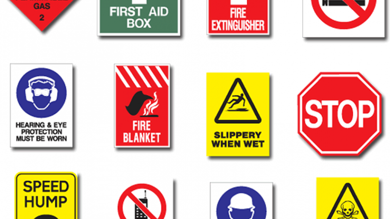 Regardless of the type of business that you operate, it is vital to have safety signs to prevent workplace accidents. OSHA law establishes certain rules, regulations, specifications related to safety signs that give instructions for using these signs in the workplace. ANSI developed these signs and standards under section Z535. Many safety signs are mandatory to have in the workplace.
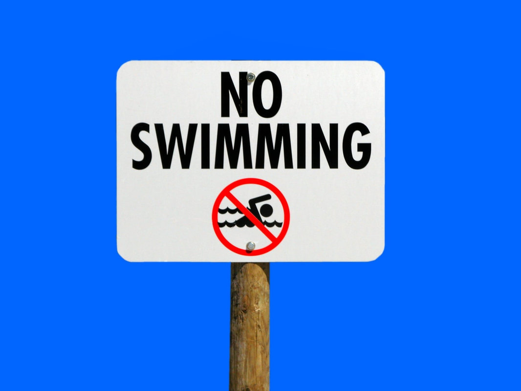
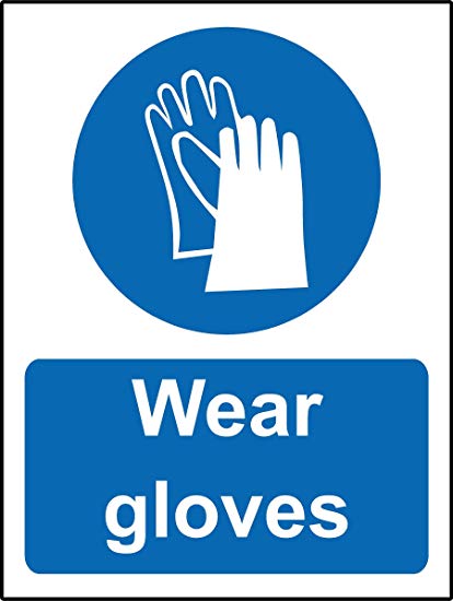
Here are some safety signs that are vital to improving the safety standards of your workplace. Fire Signs Fires can cause destruction in a matter of a minute. Fire signs help to spot fire alarms and fire-fighting equipment. The sign contains text and imagery in white with a red background. Prohibition Signs Prohibition sign is used to tell people about what they can't do in the workplace or office premises. Two main types of prohibition signs that are widely used are NO ENTRY and NO SMOKING. These signs feature a red circle with a diagonal line and a white background. Mandatory Signs Mandatory signs are used to instruct a specific behaviour or action required in an area of workplace. These signs feature a white symbol or pictogram within a blue circle on a white background. Warning Signs Warning signs are used to inform employees to be careful around hazardous areas and take precautions. These safety signs can be recognized by a yellow backhround and black triandle around the symbol of hazard. Danger Signs Danger sign is for giving warning to people about potentially life-threatening hazard that lies ahead. This sign features a red oval inside a black triangle with the text DANGER in bold and capital letters. First Aid Signs First aid signs indicates the location of first aid facilities at the workplace and shows what you should do in the case of an accident. These signs contain a white text on a green background and a usually with a white pictogram. So, make sure your workplace has these safety signs. Moreover, along with using safety signs, training employees on the meanings of these safety signs and symbols is also necessary.
0 Comments
A workplace that is prone to the accidents must have safety signs installed at prominent places. Even after proper training and instructions manuals, you need to place health and safety signs to guide trespassers and employees. Importance of safety signs signs help in keeping the workers safe. But these functional boards can also act as a guide in various emergency circumstances. As these signs are uniformly designed, they can break the language barrier among various sections of society. The graphics, colours and text on these boards are alike, therefore can be understood even by the people who cannot speak. Different Safety Signs There are 6 main categories of safety signs approved by the Australian safety board. Go through these signs to decide what symbols you need at your workplace:

Where to get these Safety Boards?
These signs are easily available in the market, both online and offline. Being standardized, these boards are easily available in standard colours and sizes for easy installation. You can also order customized signs as per the requirements from a digital printer. Or if you are creative enough, you can also design these for your workplace. Final Thoughts All these signs are approved by the Australian Security Standards. By consistently using them at your workplace, you can ensure proper security and safety. Just make sure, these safety signs are placed prominently. We all love our vehicles and want that they look best. It is extremely important to take care of your vehicle, to maintain that brand new shine. Repainting option is available since along time. But today, wrapping is an increasingly popular alternative solution in the place of car paint. Here are some of the reasons to choose car wrapping above car repainting: 1.Attractive Designs All thanks to this digital printing technology, for allowing such colourful designs and options for customization. If you are not happy with the production colour choice, you can easily opt for some other colour matching with your context. Along with colour change, you can also opt to possess various designs and specific cartoon characters designed on your vehicle for kids. All you need to do is just choosing a design and ordering the same from an appropriate service provider.  2.Resale Value
If you can maintain the original colour by the manufacturer, it increases the resale value of your vehicle to a great extent. A car wrap saves the original colour of the vehicle, and in the case, you don't like the bright colour provided by the manufacturer, you can easily shift to some sober colour without affecting the original look and lowering its resale value. 3.Durability Where painting or repainting is just painting on the surface of the vehicle, these vinyl car wraps act as a shield over the vehicle. These vinyl wraps create a 3 mm thick cover over the vehicle, which is durable for up to 3 to 10 years depending upon the exposure to the Sunlight. 4.Lead Time Painting the vehicle requires a lead time of at least 2 weeks during which you are left without a vehicle, affecting your daily routines. But these customized wrapping jobs can be completed in just 3 to 4 days. All you need is to find a suitable service provider and hand-over him the selected design. You can get your vehicle wrapped with the desired style in just 3 to 4 days. 5.Advertisement If you own a business and looking for some advertisement options, these vinyl covers are the perfect choice for your next promotional campaign. You have the option to have specially designed logos stick to your vehicles, by bringing uniformity in all your vehicles. You can even opt to change these stickers, as and when required. 6.Cost The cost of vinyl wrapping is much lesser than the traditional painting jobs. The cost of car wrapping is almost half of the painting jobs. As it is less expensive, you can change these stickers after a specific period. Whereas, repainting being expensive, it is a life-time job for the vehicle. 7.Maintenance Painting jobs are more demanding than the vinyl sticking. A repainted vehicle needs to be taken care of, for damages and scratches and also demands regular cleaning. On the other hand, these wrappings require less maintenance and can be cleaned by just wiping with a piece of cloth. Final Words Van wraps and vehicle wrapping is much easier and pocket-friendly. Still, the decision is yours. The market is facing a rat race for the survival of fittest. With the ongoing shift over digital advertisements, somehow printed advertisements have managed to maintain their stand and position engraving the need for some physical advertisements. For the physical stores, fairs, seminars or hoardings, you need to have an advertisement hoarding to have all together with a different fan base. As your business is unique and different from others, your advertisement needs to showcase your unique business as well. Designing an advertisement banner such as exhibition signage, pull-up banner, X-banners might seem easy but it is not. Each banner needs to be treated individually. Just after seeing a banner the potential customer should know why they should choose your business or product(s) over others!!!  Here, are some cool hacks to consider while designing your next advertisement banner: Clearly Defining the Purpose Before we move further and talk about the composition and other effective mediums for creating eye-catchy banners, sit and decide the purpose of your banner. In the case of advertisement banners, there is a number of options available in the market depending upon the usage. Each type of banner has altogether different usage, for example, a pull-up banner is suitable for seminars and indoor presentations whereas an X-Banner has multi-purpose utility- usable in both indoor and outdoor advertisements. If you are starting a new business, you should design your banner in such a way that it tells the visitors, why they should try your product(s)? On the other hand, if you are an old player you need to keep up with those clients along with attracting the new one. Your banner tells a lot about you, not taking it seriously might cost you huge!!  Size of the banner Before designing a banner you need to decide what size of the banner is suitable for you. If you are looking something to be placed as hoarding over and above the store, a huge size banner might work for you on the other hand if you want to advertise your business in some fair or seminar, a smaller banner will work wonders for you. Also, banners are available in both horizontal and vertical formats. Vertical banners are more informative than Horizontal ones. Vertical banners can be hanged from the ceiling or can be placed along with a stand such as X-banners. Clearly defined frame Let's start with the area of your frame, in order to design an eye-catchy banner, you need to first decide the boundaries and outer side of the frame. An advertisement should always have proper limits and outlines. It is better to decide the number of white spaces you want to leave in the space. By white space, I do not mean the space in white color rather it means the blank areas in the canvas. In recent studies, it has been observed that banners with proper framing and outlines catch the attention of the visitors more than those who don't have any specific boundary. Composition After you are done with defining the boundaries and creating an outline, its time for you to decide the main aspect of your banner that is the composition of various contents on the frame of the banner. For deciding composition, firstly you need to calculate the space that is left after marking the boundaries and white spaces on the canvas. Now, what you are left with is the printable space for your banner. Composition of your banner includes Headings, Sub-headings, Focal point i.e. area of the main focus for your banner. It includes deciding the proportion of the logo of the business, tag lines, and other contents like the call to action (CTA). 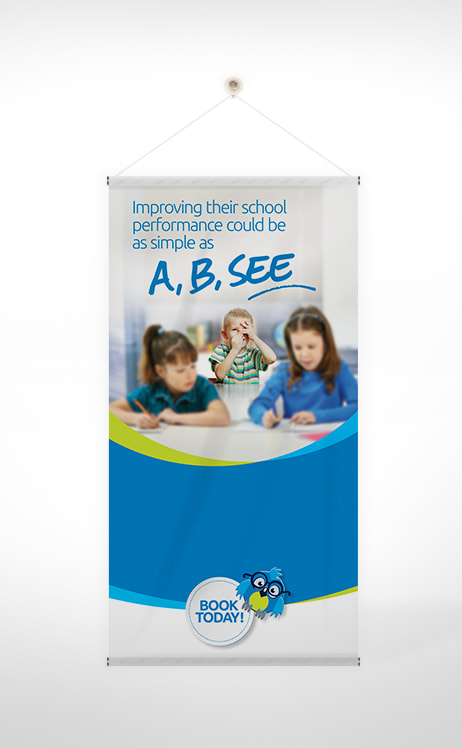 Font
Selecting the different type of fonts seems interesting, but it is also very tricky. It is always better to use the same font in all advertisement banners, it creates a unique image of your brand and brings brand consistent tonality. The font in the main headline should always be bold enough to catch the attention of the visitors. A hierarchy should be maintained to maintain the flow of the content. By changing the font you can catch the visitors attention towards the change of topic or thoughts. It better to avoid using cursive writings, it brings strain to visitors mind and he may find it hard to understand. Content Deciding content is just like lyrics to a song. The content of an advertisement banner is the king. The overall look of the banner is decided by the designing and all, but the main part is content. The inclusion of photographs and logo of the business defines the purpose of the advertisement. The whole content should be designed in a way that defines the purpose of your business. It should answer the following questions to readers' mind- How you are different from others? Why they should choose you? Whatever you decide to write should always maintain a hierarchy accompanied by Call to action (CTA). Conclusion Now you know what are the perquisites of designing a banner for your next advertisement. Just follow the above steps and you might be having a colorful banner designed just under your hand. You can always choose to be creative for your own purpose. Even if now designing a banner seems a daunting task to you go ahead and choose some service provider or digital printer which can help you do the graphics and create great business advertisement banner.  Brochures and Booklets are one of the best mediums to provide detailed information about your business. They let you showcase your company and tell people about your product or services and your business goals. Brochures and Booklets help in grabbing the attention of your potential customers and hence they should not be underrated.
Thus, when it comes to brochure and booklet printing, you should never rush. You need to be attentive and focus on all the aspects of it. If you wish to create a professional-looking and compelling brochure and booklet, do consider the following things! Your Purpose The most important thing to consider is your purpose of brochure and booklet printing. Your overall goal defines and determines all the other aspects like size, design, length, shape, etc. Be clear of what you want. Do you want to showcase or promote your business or brand? Or you want to give information about your product or services? Or you want to inform about any promotional event? So, know your purpose whether you want to promote, sell, or just inform. There could be various purposes. Size of the brochure or booklet The size of the brochure or booklet depends upon what and how much information do you want to convey through them. Usually, the standard size of brochures is 8.5x11. But if you have a lot of information to share, that means there are a lot of texts to incorporate then choose the larger size. Choosing a larger size will help you to limit the number of pages of the brochure or booklet. This is necessary to not to let your customers feel like they are reading a novel which might make it boring or tiring for them. You may also make it small in size according to your need. Choosing the wrong size may stretch or cut-off the important information. Also, be careful while choosing the template. Choose the correct template. Binding method Choose the right binding method for your brochure. The quantity of pages of your brochure directs the binding method you choose. Stapled or perfect-bound are widely used for binding methods. Though both are effective, they differ in their looks. It is often recommended that if you have less number of pages, let’s say around 8 to 50, then the staple type of binding is more preferable. And if there are more no. of pages like around 20 to 250, then perfect binding should be your choice. However, your choice also depends on how you want your brochure to look. Moreover, leave enough space for binding to make sure to not to cut off important text. Final Thoughts... These are the important factors to consider while printing a brochure and booklet. Apart from them, choose the high-quality images, create an appealing cover page and make sure to do the proofing. A brochure or a booklet with high-quality content and images will be preferred more than the one with low-quality images and grammatical mistakes. |
 RSS Feed
